
Smart Design for Real-World Retail: Finding the Sweet Spot Between Form and Function
In premium retail, aesthetics captivate, but functionality converts. A beautifully executed fitout might grab attention, but if it doesn’t support intuitive flow or operational ease, the customer experience breaks down fast. Too often, visual drama is prioritised at the expense of usability. The real value? A seamless blend, where every design choice reinforces both brand experience and commercial performance.
Here’s how to strike the balance, without compromising either.
1. First Impressions Matter—But So Does the Exit Strategy
A striking entrance draws customers in, but the full experience is what leaves a lasting impression. Prioritising impact at the front while neglecting journey flow often leads to drop-offs and frustration.
Trinity Tip: Map out the full path. Use lighting cues, floor transitions, and layout zoning to intuitively guide customers from arrival to engagement areas, all the way to checkout.

2. Joinery Should Look Smart—And Work Smarter
Custom joinery should do more than look beautiful. If shelving doesn’t support product access or displays obstruct restocking, inefficiencies pile up fast.
Trinity Tip: Collaborate with your ops team early. Design joinery around product specs, stock handling, and durability. Finishes should look premium, but stand up to real-world use.

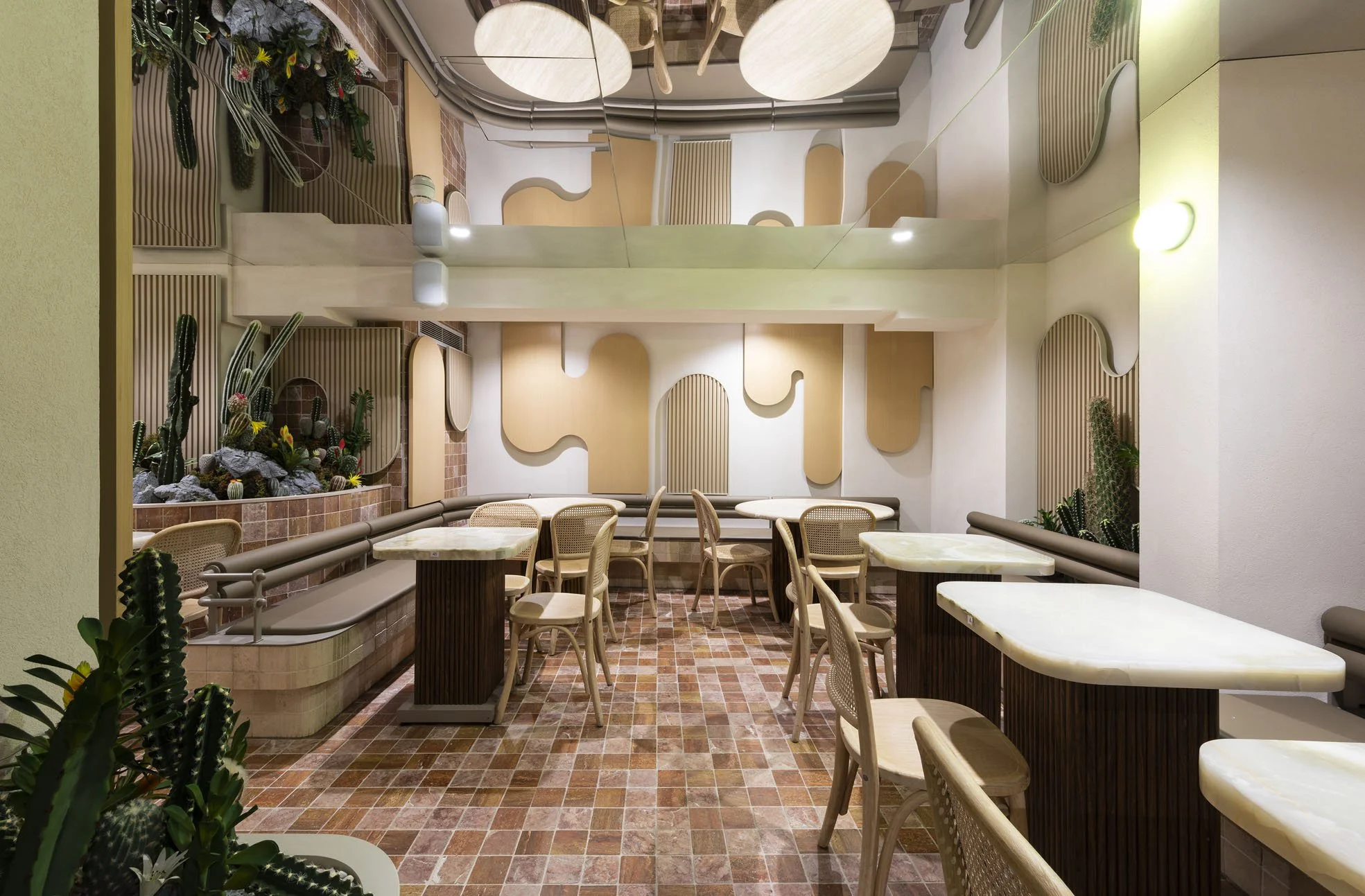
3. Fixtures & Furniture: Comfort Is Not a Compromise
Design-forward seating or counters can elevate a brand, but not if they hinder comfort or flow. Oversized furniture can crowd walkways, interrupt movement, and reduce flexibility.
Trinity Tip: Select pieces that strike a balance, visually aligned with your aesthetic, yet ergonomic and adaptable. Always test key furniture elements in real-life conditions.
4. Storage: The Backbone of a Seamless Experience
Minimalist floor plans are visually clean, but things fall apart without smart storage. Poorly planned storage leads to clutter, inefficiency, and disrupted replenishment.
Trinity Tip: Integrate concealed storage into your floor fixtures. Design back-of-house areas to match actual daily needs, not best-case scenarios.

5. Lighting + Materials: Designed to Work Together
What looks stunning in a material sample may react poorly under retail lighting. Reflections, shadows, and glare can interfere with product presentation and customer comfort.
Trinity Tip: Mock up finishes under lighting conditions. Choose materials that work with your lighting strategy, especially in key zones like POS, windows, and feature displays.

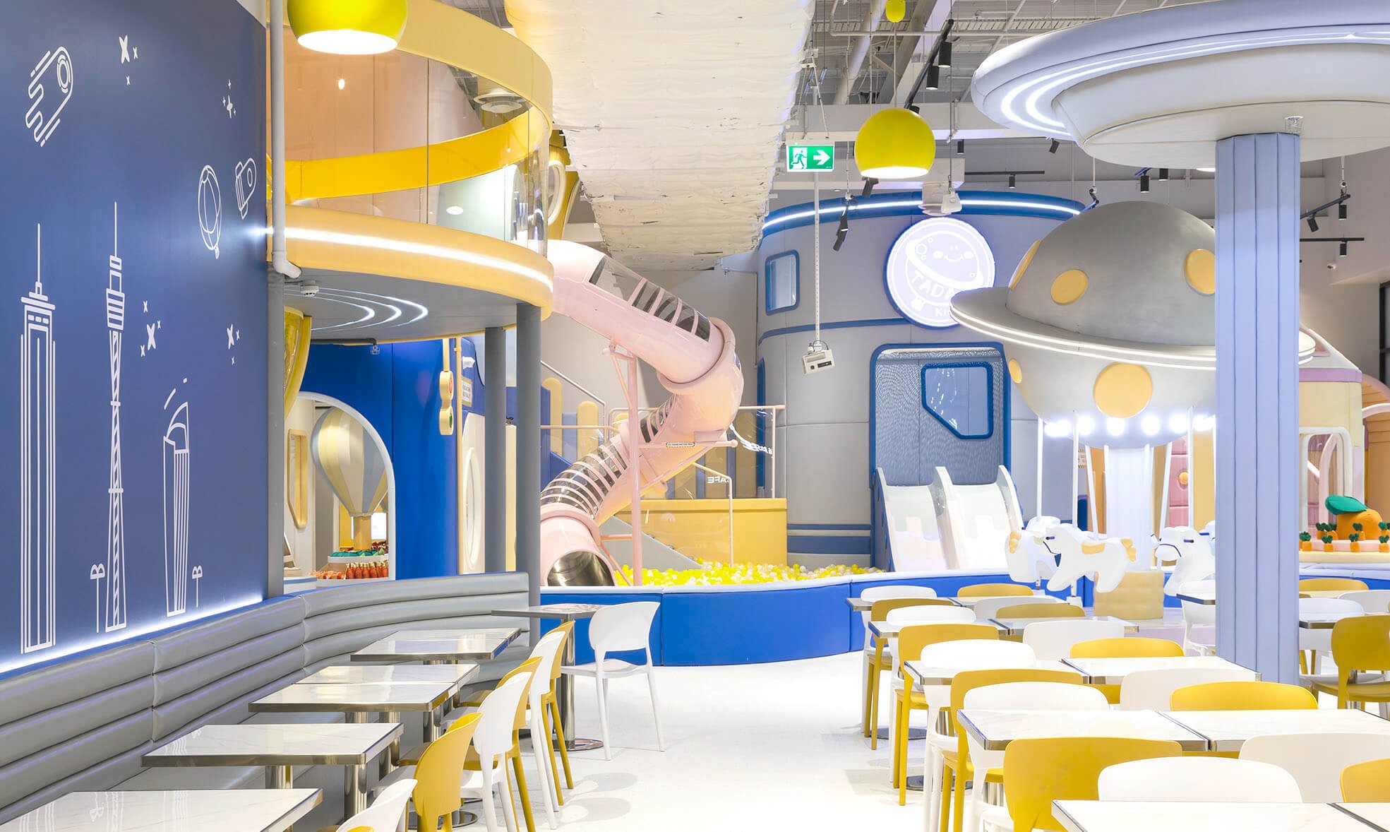
6. Technology Must Feel Seamless
Tech adds value when it integrates cleanly. Screens, sensors, and cables should enhance, not compete with, your store’s visual flow.
Trinity Tip: Plan for tech early. Conceal infrastructure within joinery. Position screens and digital tools at intuitive heights and angles that support your space narrative.

7. Flexibility: Your Most Valuable Asset
Retail changes fast. A layout that suits today’s range may struggle with tomorrow’s campaign. Without modularity, even minor updates require major work.
Trinity Tip: Use movable joinery, flexible lighting, and modular fixtures. Plan power and lighting zones with future change in mind.
8. Don’t Neglect the Back-of-House
Customer experience begins with your team. If staff areas are cramped or inefficient, service quality suffers.
Trinity Tip: Design for your team’s workflow. Include ergonomic workspaces, organised prep zones, and proper break areas. Supported staff create better customer moments.

Final Word
A retail space that looks the part must also live up to its promise. At Trinity Shopfitting, we design and deliver environments where style supports performance—and every surface has a purpose. From planning to fitout, we blend creative vision with operational insight, ensuring your space doesn’t just look exceptional—it works brilliantly too.
Let’s create a fitout that performs as well as it photographs.