Beyond the Surface: Using Colour Psychology to Shape Commercial Interiors
Colour is more than a finishing touch. It’s a strategic design decision that directly impacts customer experience, brand perception, and business performance. In commercial interiors, particularly in retail, hospitality, and workplace environments, colour influences how people feel, behave, and engage
When chosen with intention, colour can attract foot traffic, improve dwell time, reinforce brand identity, and even drive purchasing behaviour.


At Trinity Shopfitting, we understand how to bring these elements together through fitouts that are both visually compelling and commercially effective.
Here’s how top-performing commercial spaces use colour psychology to create meaningful and measurable results.
1. Colour Sets the Emotional Tone
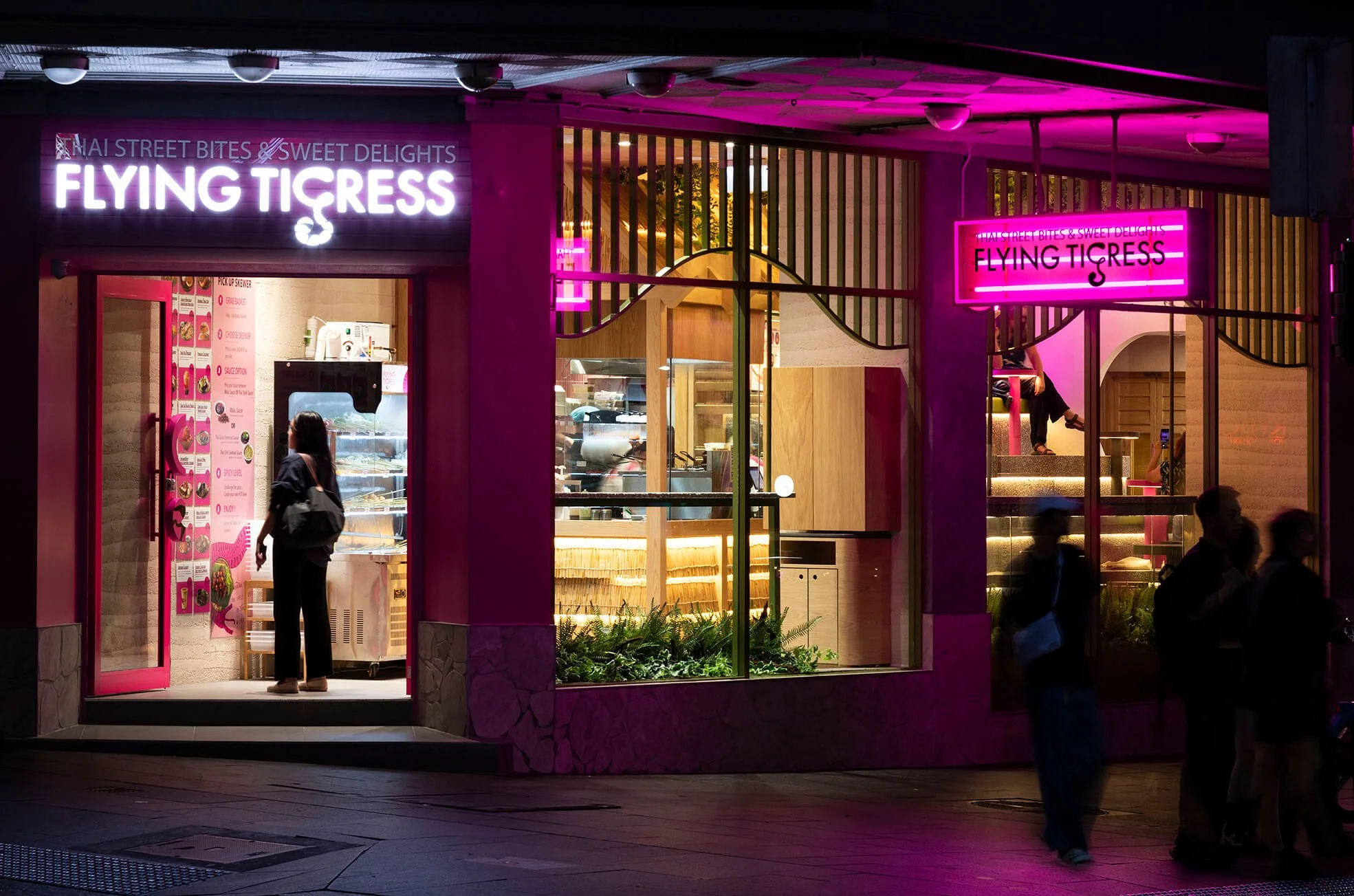
Every colour evokes an emotional response. From trust to excitement, exclusivity to playfulness. Your palette speaks before any signage does.
Common associations:
Blue: Trust, calm, professionalism (finance, healthcare)
Red: Urgency, appetite, energy (hospitality, discount retail)
Green: Wellness, nature, balance (health, beauty, eco brands)
Black: Luxury, sophistication, boldness (premium retail)
Yellow: Optimism, energy, youthfulness (lifestyle, cafés)
Trinity Tip: Choose colours that align with your brand values and target audience. A wellness-focused café might use muted greens and earthy neutrals, while a luxury boutique could feature rich tones with metallic finishes.
2. Colour Affects Flow and Dwell Time
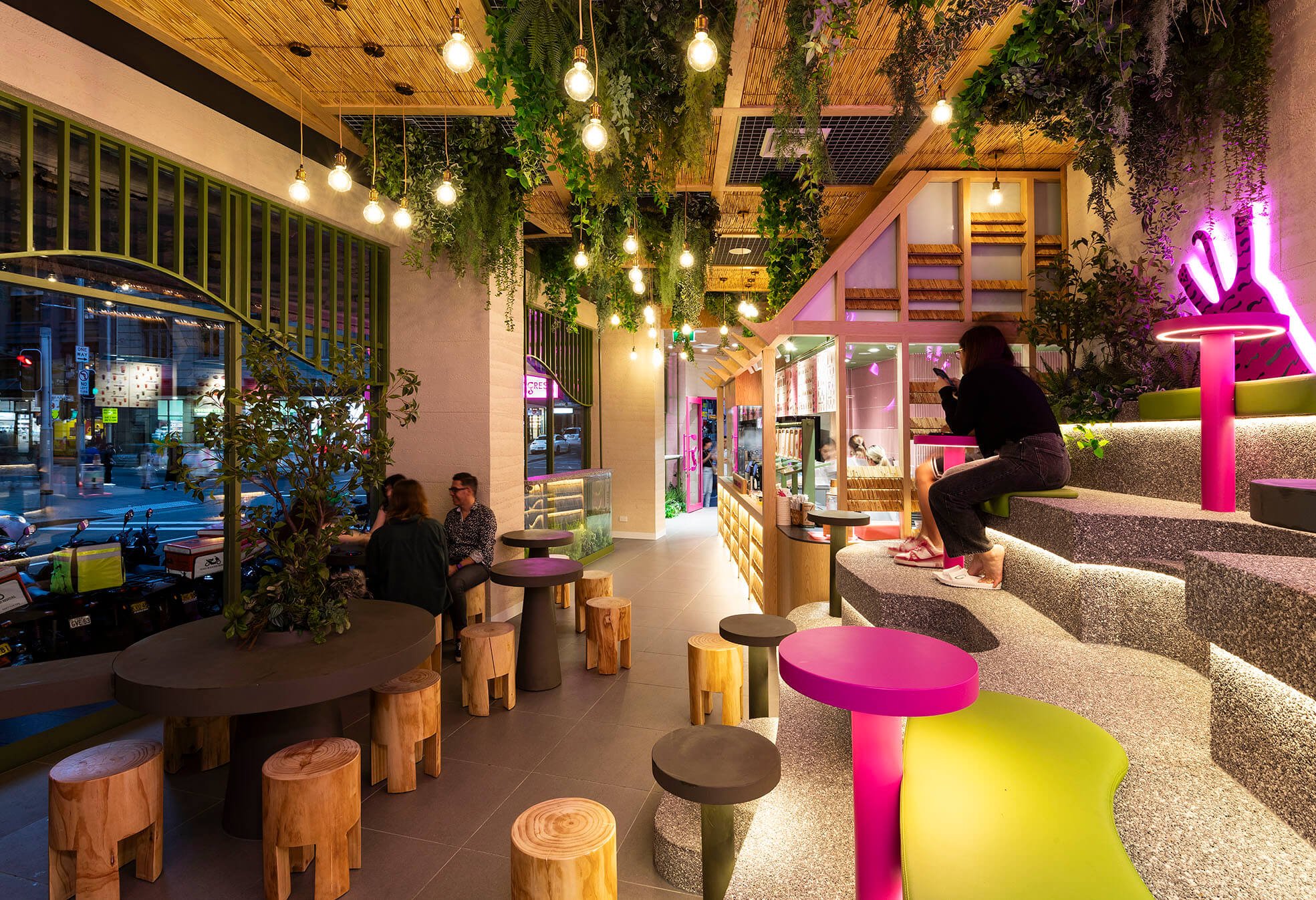
Warm tones (reds, yellows, oranges) stimulate energy and create urgency, while cool tones (blues, greys, pastels) encourage calm and a longer stay.
Example: A tech retailer highlighted new products using bold warm accents, while seating areas used cooler tones to encourage customers to relax and explore.


Trinity Tip: Use colour to zone your space, energise entry points, calm down seating zones, and direct attention to key merchandise through contrast and focal colours.
3. Colour Supports Wayfinding and Spatial Clarity
In large or multi-functional venues, like clinics, department stores, or hospitality precincts, colour becomes a navigational tool.
Example: A medical centre used colour-coded corridors (green for paediatrics, blue for general medicine) to make wayfinding intuitive for first-time visitors.
Trinity Tip: Incorporate colour into flooring transitions, feature walls, or overhead elements to define areas without relying solely on signage.
4. Colour Changes How Space Is Perceived
Light colours make a space feel larger and more open. Darker colours add intimacy and luxury, but can reduce perceived space when overused.
Example: A retailer used a ceiling to lower the visual height and create intimacy, balanced by mirrors and lighter joinery to maintain a feeling of space.
Trinity Tip: Balance is key. Use deeper tones in focal points or ceilings, and light-reflective surfaces where openness or brightness is needed, especially in smaller footprints.
5. Colour Strengthens Brand Recognition
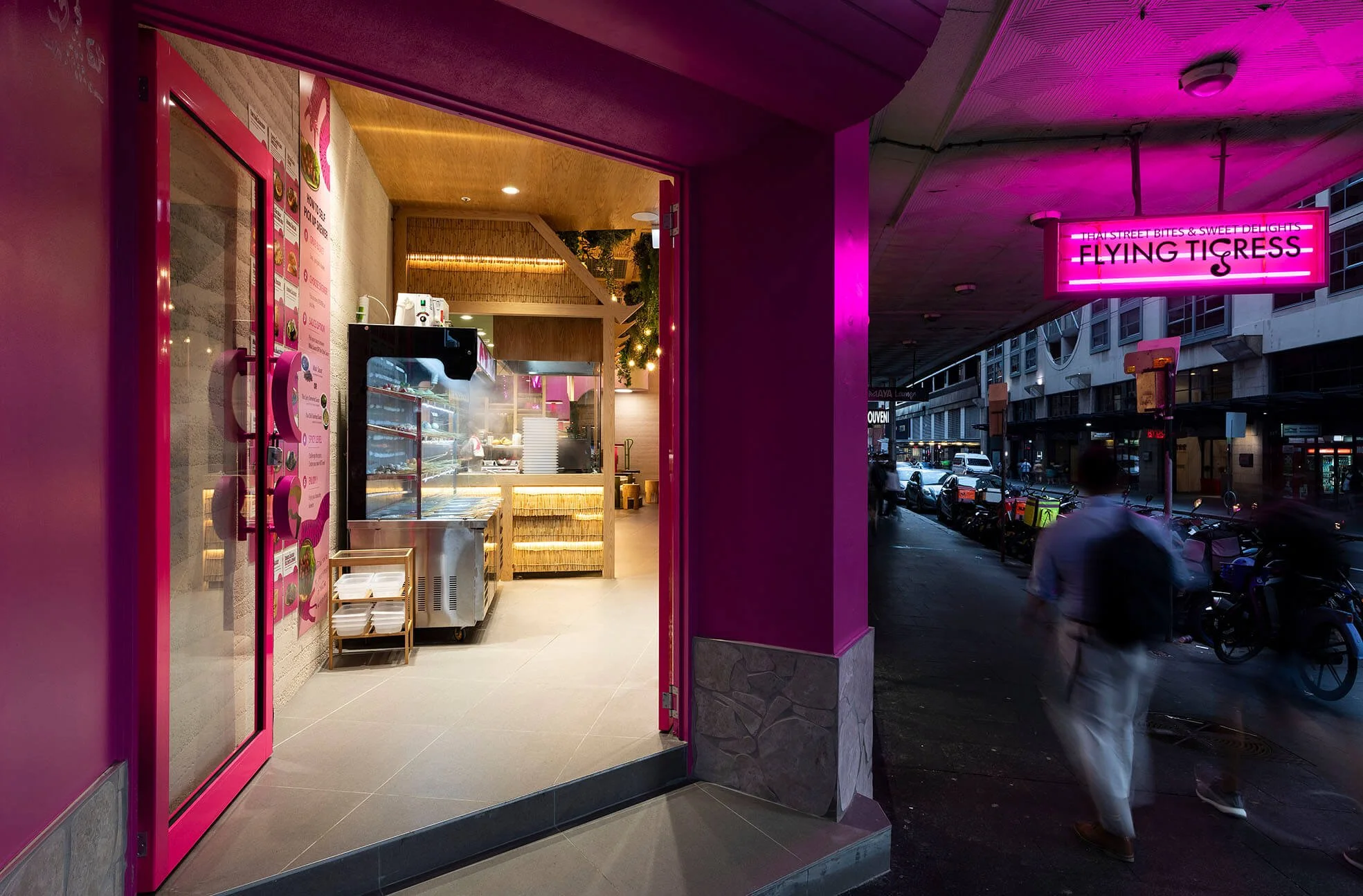
Consistent use of brand colours across your physical space reinforces identity and recall, especially in national or multi-site rollouts.
Example: A beauty brand integrated its signature coral tone across joinery, signage, and packaging, creating cohesion across retail, online and social platforms.
Trinity Tip: Use your brand palette in key touchpoints, entry features, POS areas, mirrors, and signage without oversaturation. Subtle consistency builds a strong and memorable brand presence.
Final Word
In commercial fitouts, colour is more than visual. It’s emotional, strategic, and deeply functional. When approached with intention, colour enhances not only your space, but your brand performance.
At Trinity Shopfitting, we collaborate with interior designers, architects, and brand teams to create spaces where colour, layout, and build quality work together to deliver results. Whether you're building a café, retail concept, or wellness space, we help turn vision into reality—with every detail considered.
Let’s bring colour strategy into your next fitout.
Get in touch to talk through your space.


